Garmin Sport — Group Exercise Feature Design
A 2-person UX research project proposing three features to help Garmin Sports users organize and enjoy group exercise. SUS score: 73.9 (n=7, preliminary).
UX Research, UI Design
Overview
Garmin Sport UX Design is a two-person UX research and design project completed for the EMI UX Design course (2024). The team investigated how the Garmin Sport app could better support people who exercise in groups — hiking, cycling, and running — and proposed three connected features: personalized route recommendations, a faster way for groups to agree on a route together, and a single place to plan, track, and revisit group exercise events. The concept was usability tested with seven users, returning a System Usability Scale (SUS) score of 73.9, alongside qualitative task-based interviews.
My Role
I worked in a two-person team with Wendy Tsai (UX/UI Designer) on this project. My contributions included leading the user interviews and persona synthesis, designing feature 3 , running the usability testing, and presenting.
Research
Market & Competitor Context
——————————————-
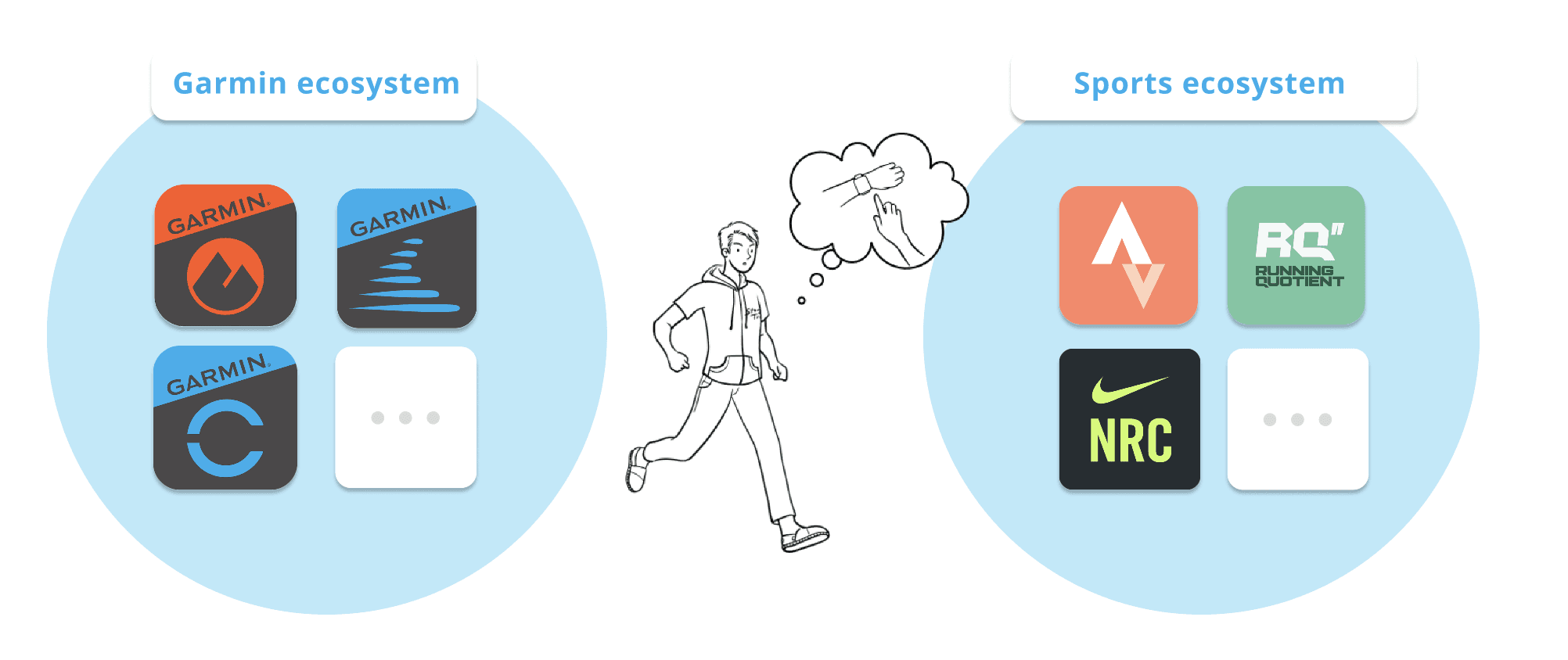
Garmin's ecosystem spans professional sport tracking, communication, and gaming features, but interviews surfaced a specific gap in Garmin Connect's social features: participants said they had no one to share their exercise data with, that the app surfaced raw numbers rather than interpretable insights, and that when they did want to share an achievement, they took a screenshot and posted it elsewhere. Garmin Sport, the app with the stronger social layer, is positioned very differently from its main competitor, Strava, which has roughly 500 times the install base. Strava's social features center on casual, everyday sharing across a broad range of users; Garmin Sport's center on competition, events, and rankings for a more performance-focused audience. That distinction became the anchor for where the team chose to design.
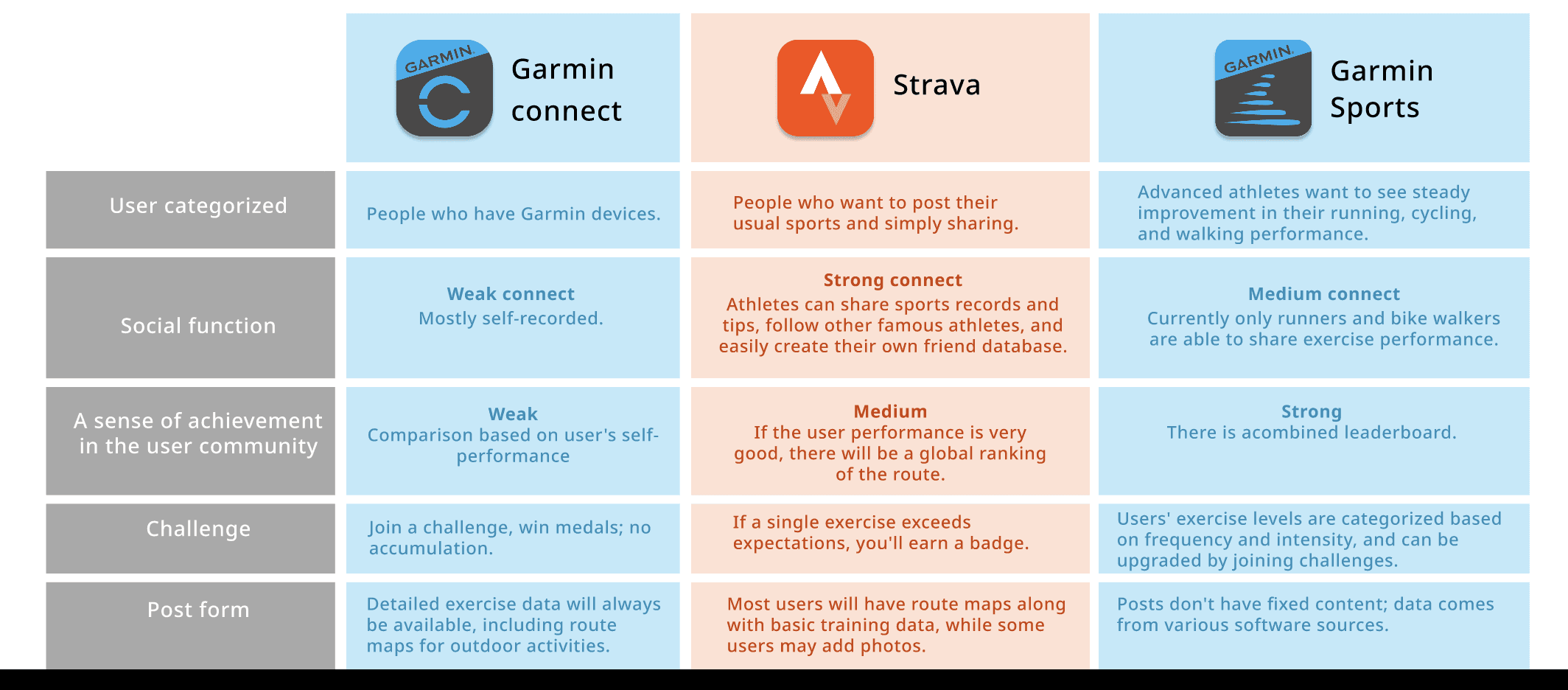
Figure 1. Comparison between Garmin ecosystem and Strava.
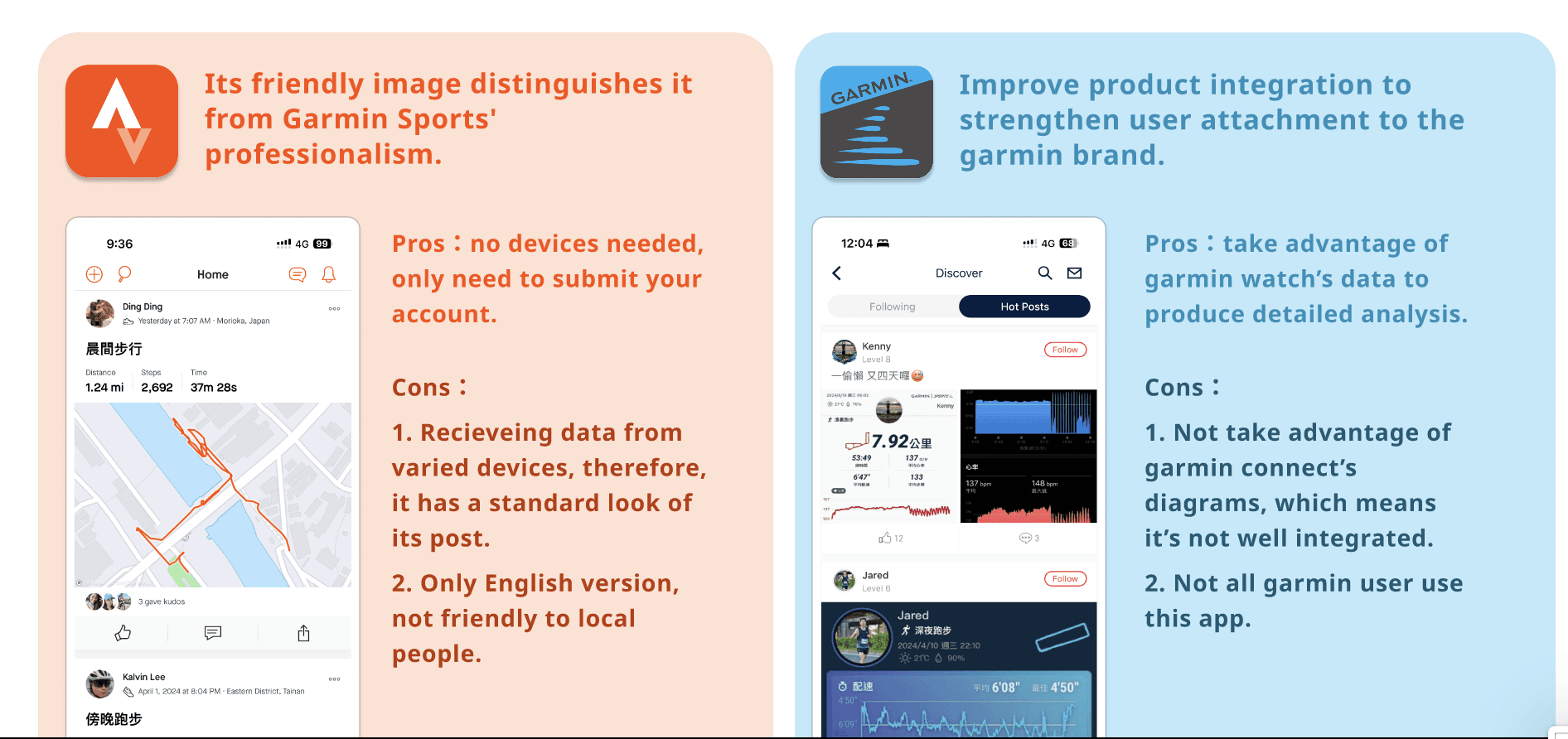
Figure 2. Social media functions comparison between Strava and Garmin Sport.
User Interviews
————————
The team interviewed 8 people with a range of exercise habits — solo and group, running, cycling, hiking, swimming, and yoga, at frequencies from a few times a month to daily — using a mix of apps including Strava, Garmin, Nike Run Club, and Xiaomi Health. From these interviews, two personas were prioritized: Motivation-independent exercisers, who lack a consistent companion or the confidence to start, and found Garmin Sport's competitive framing unwelcoming to newcomers with no way to group with friends or get a personalized recommendation; and Do-together-and-harder exercisers, who already exercise in groups but found planning repetitive (same routes, time-consuming coordination) and wanted a single private platform for both planning and recording, rather than switching between a messaging app and a fitness app.
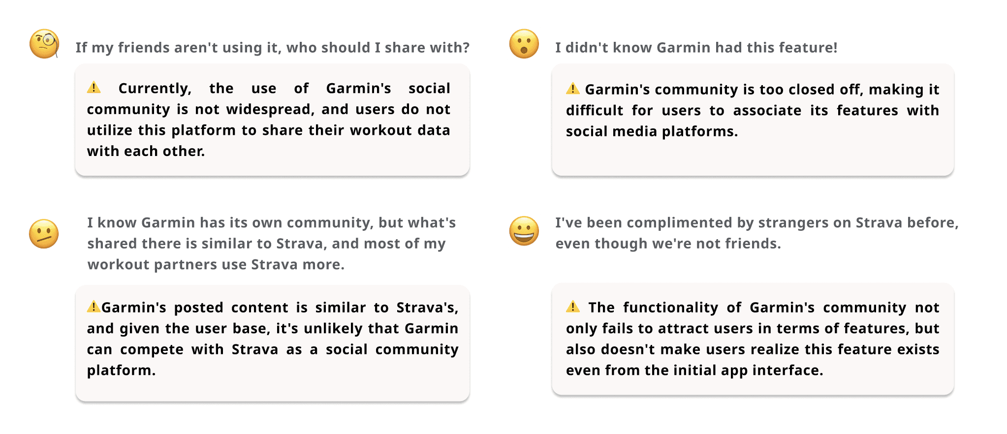
Figure 3. Interview quotes from users which became our major revision direction.
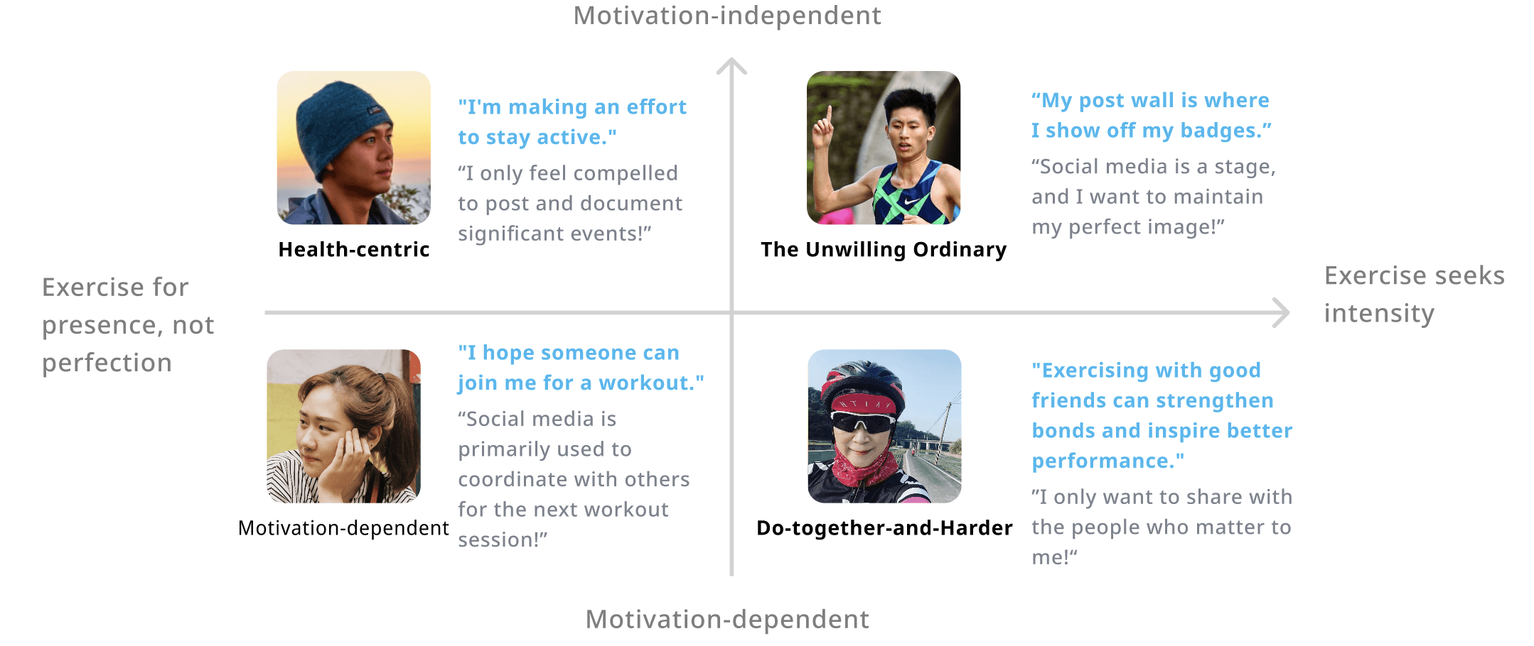
Figure 4. From interviews, we identified four different app users and eventually focused on "Exercise-with-you" and "Do-together-and-harder" personas.
Problem framing
The design question the team converged on: how might we help Garmin users more easily enjoy group exercise and gain a sense of accomplishment in the process? This translated into three design goals — exercise freshness, a stronger sense of belonging, and a more holistic exercise experience — each mapped to one feature: viewing recommended routes, choosing routes with friends, and embarking on an adventure together as a continuous flow.
Design Concept
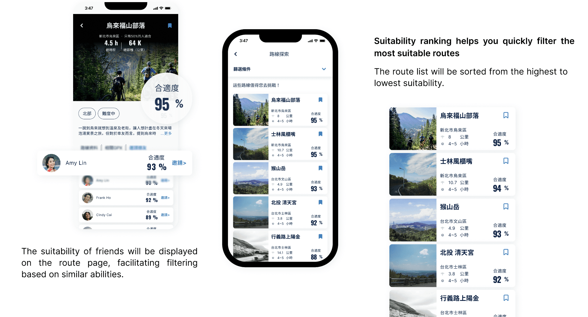
View Recommended Routes — Previously, users searched for new routes across scattered websites with no reliable way to judge whether a route suited them. The feature surfaces route recommendations personalized to a user's exercise history, aiming to balance freshness with confidence that the route is a good fit.
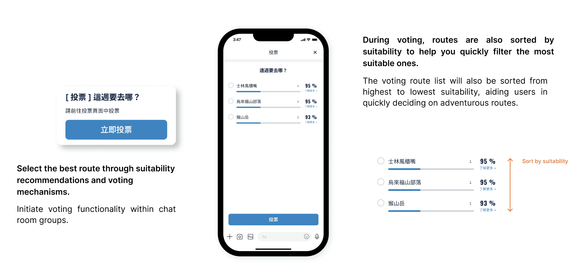
Choose Routes With Friends — Groups previously coordinated over messaging apps; voting was fast, but getting the whole group familiar with and comfortable with a route took much longer. This feature moves route selection into a faster, more structured in-app decision flow.
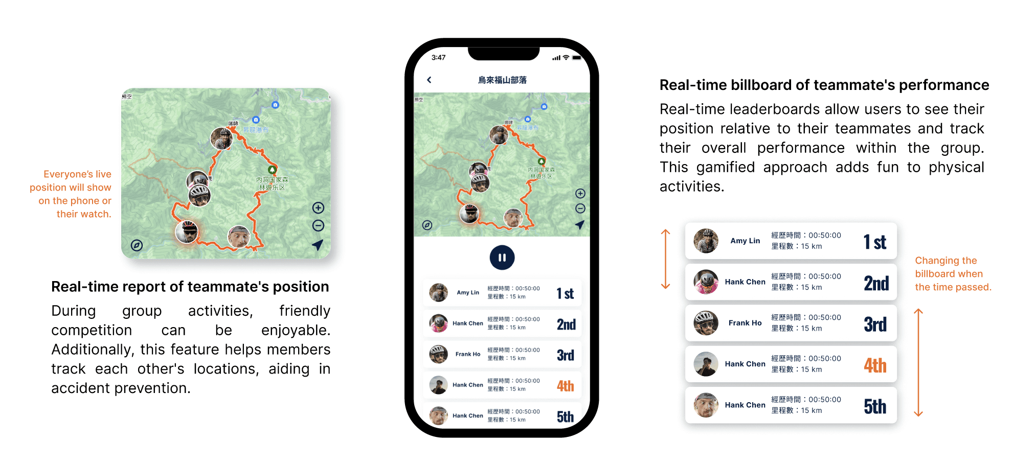
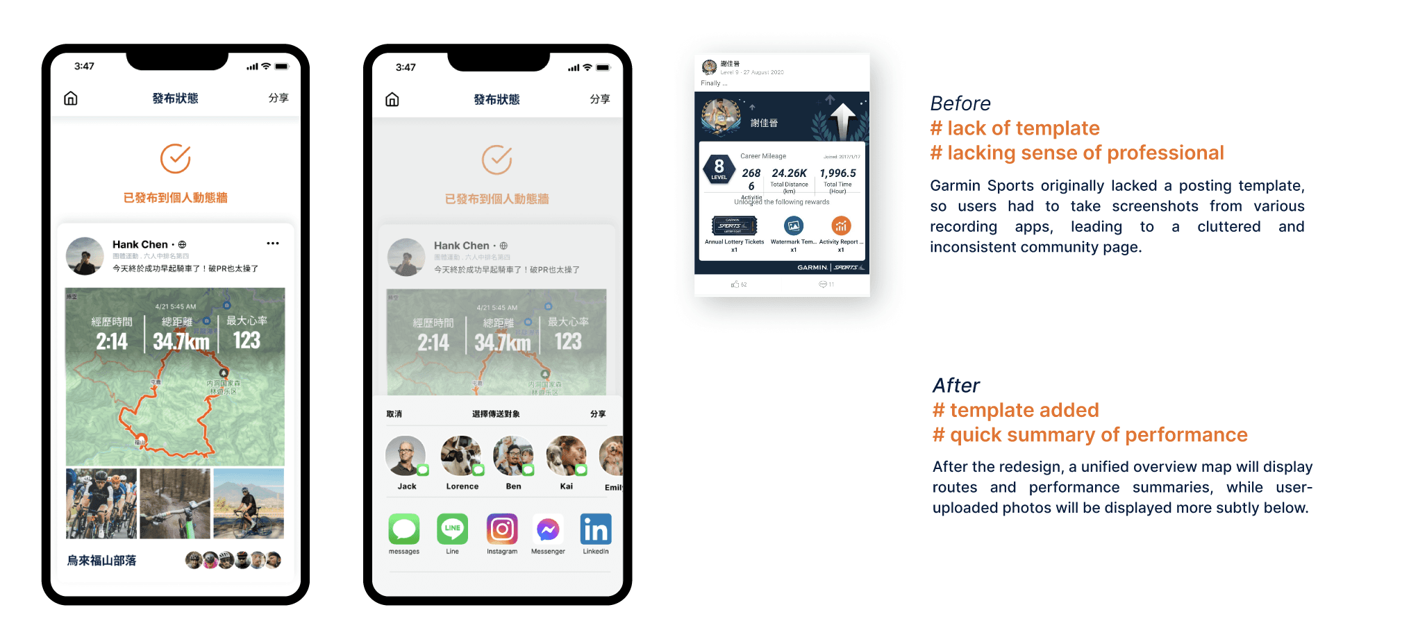
Embark on Adventure Together — Photos, personal performance data, and event memories were previously scattered across different apps, making it hard to look back on shared experiences later. This feature consolidates planning, live tracking, and post-event records into one continuous flow inside the app.
Validation
The team ran a task-based usability test with 7 users, combined with qualitative interviews, and measured a SUS score of 73.9/100. Positive feedback centered on how much easier it was to agree on a route within a large group, saving the time previously spent manually assessing everyone's ability level. Negative feedback pointed to an information architecture issue — the button to join or "grab" a group was hard to locate — and text size that was difficult to read for older users. Worth stating plainly in the write-up: this is a small, preliminary sample (7 users, 4 with overlapping profiles), so the SUS score should be read as directional feedback on a design proposal, not as a validated, shipped-product outcome.
Reflection
This project followed a conventional problem-solving process: interviews → personas → HMW → feature design → usability testing. That framework converges quickly on shippable feature proposals, but it also has a built-in limitation — it treats something like "lack of an exercise companion" as a problem to be solved, rather than exploring what solo exercise means to the person experiencing it. My current design approach is more concerned with supporting reflection than prescribing solutions. This project represents an earlier stage in that shift, and I keep it in my portfolio because the research process — not the final framing — still holds up.
Impact
Process
Reflection